
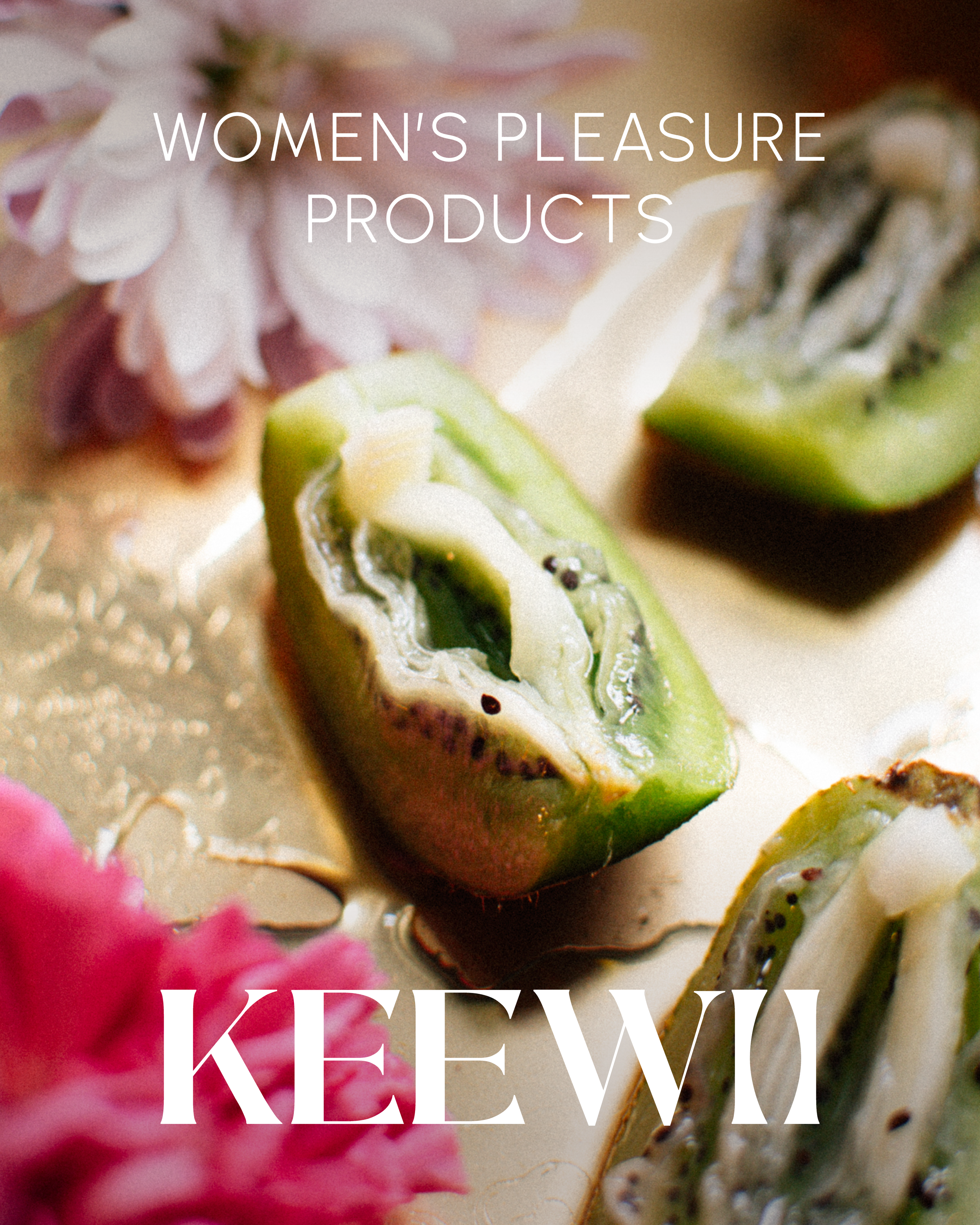
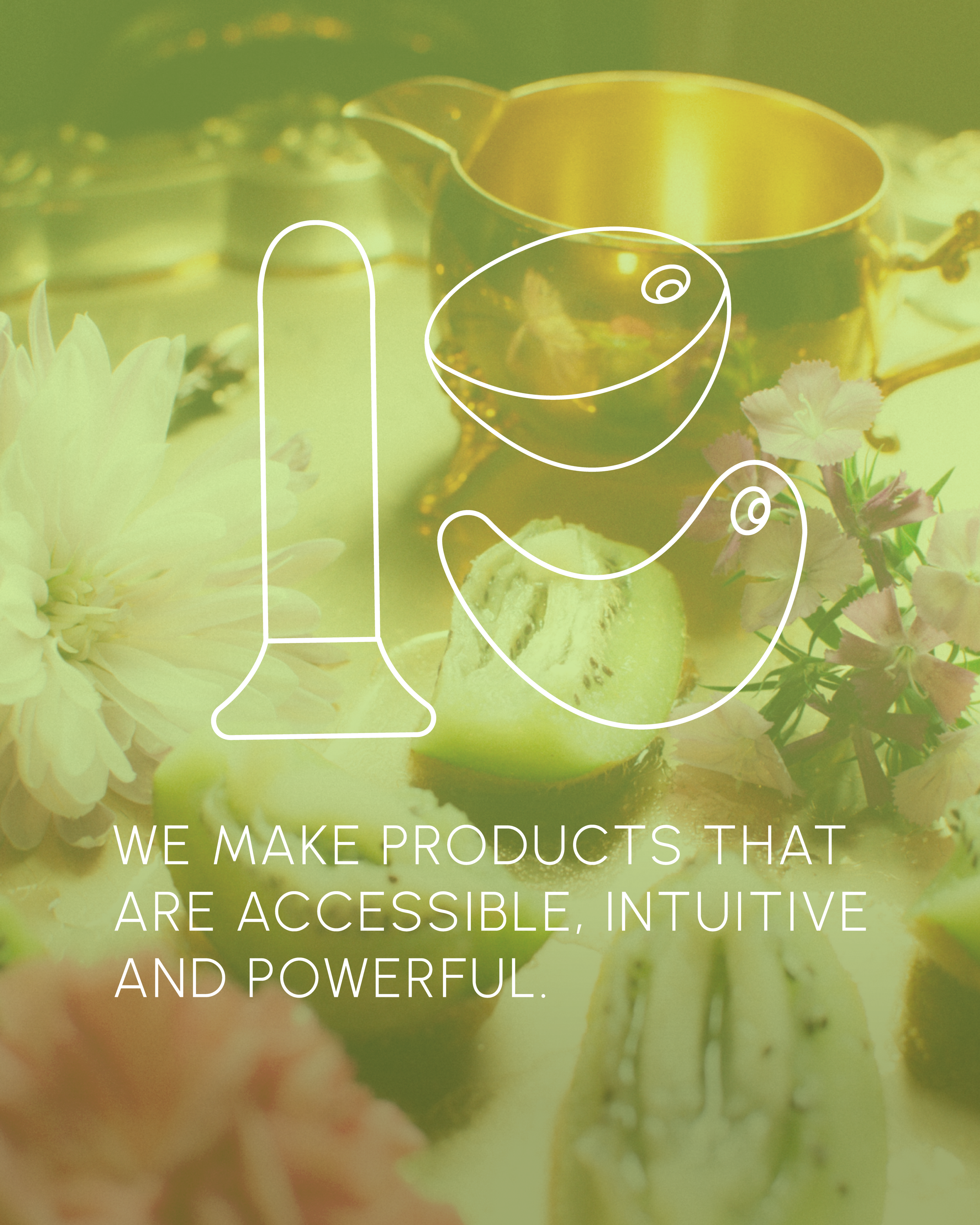
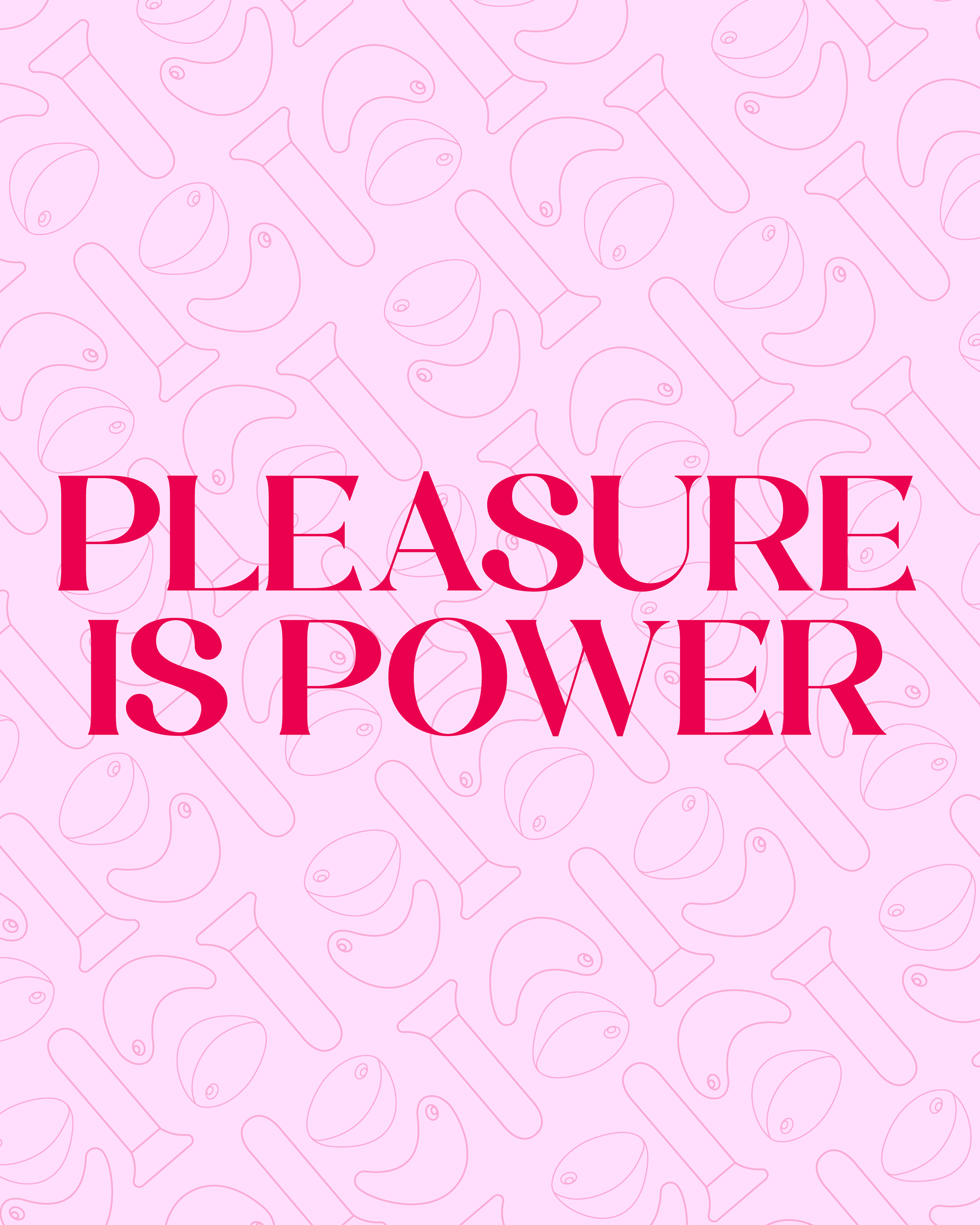
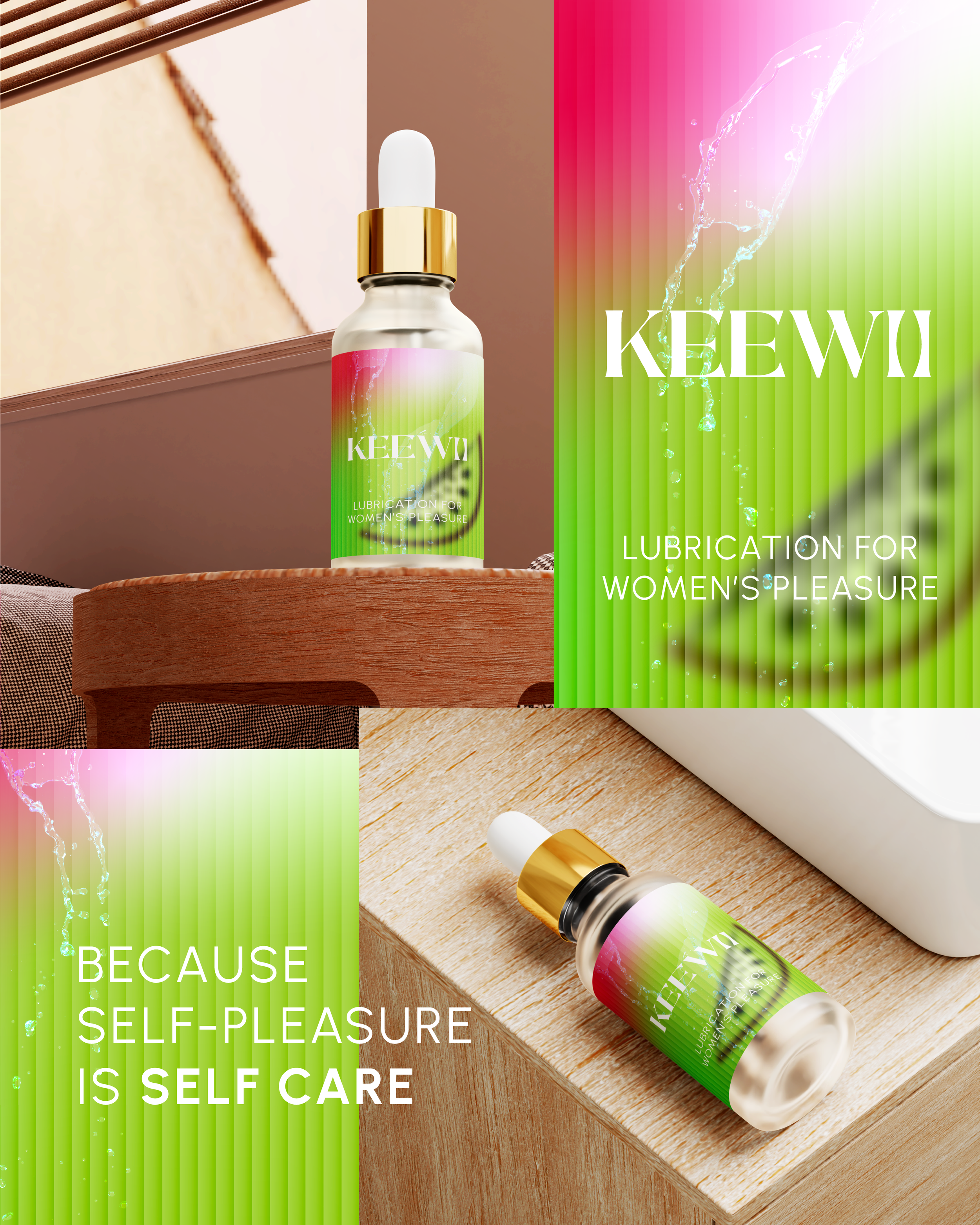
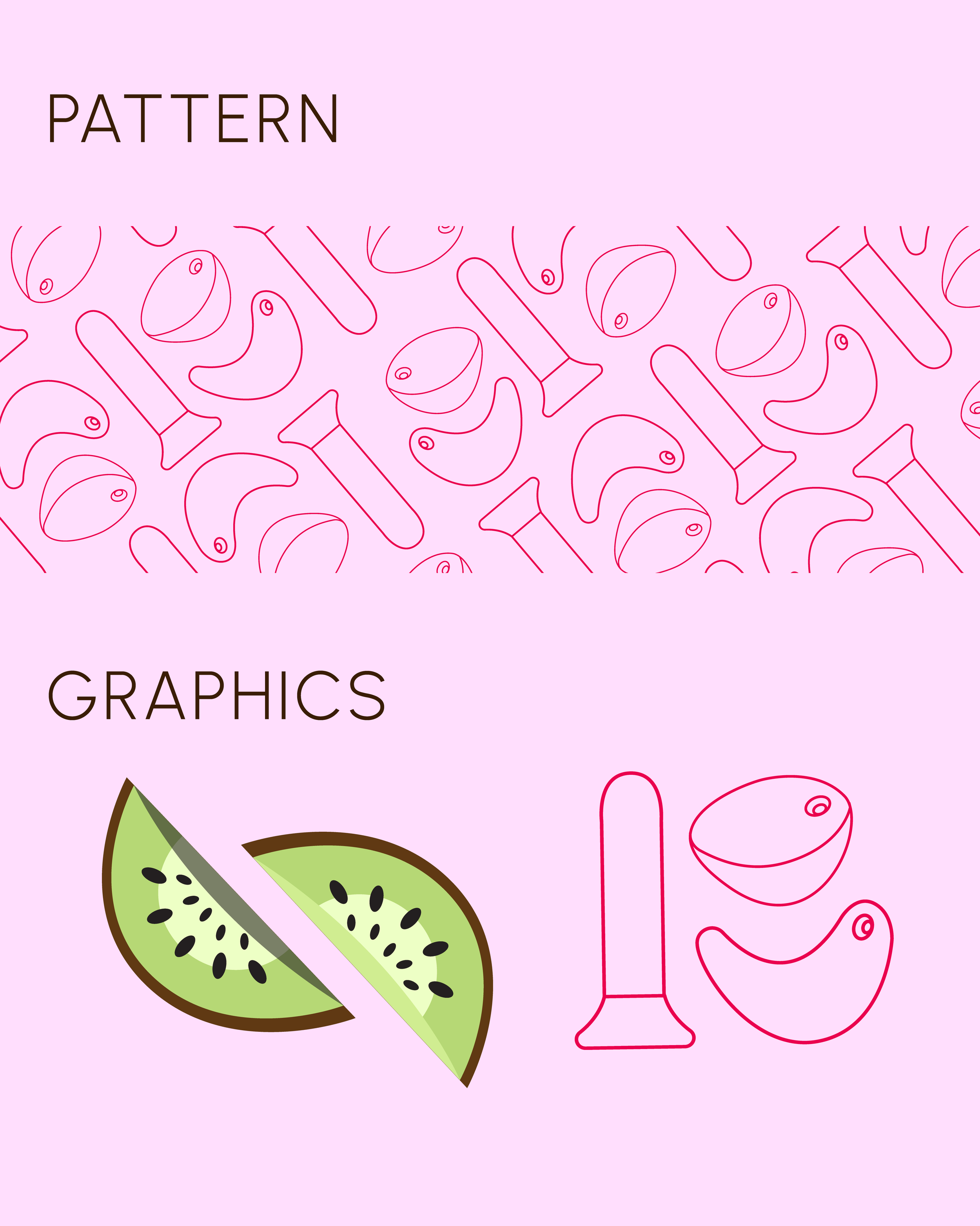
This branding project was designed with the intent to create a vibrant, sensual, & delicious visual identity for a luxury pleasure product brand.
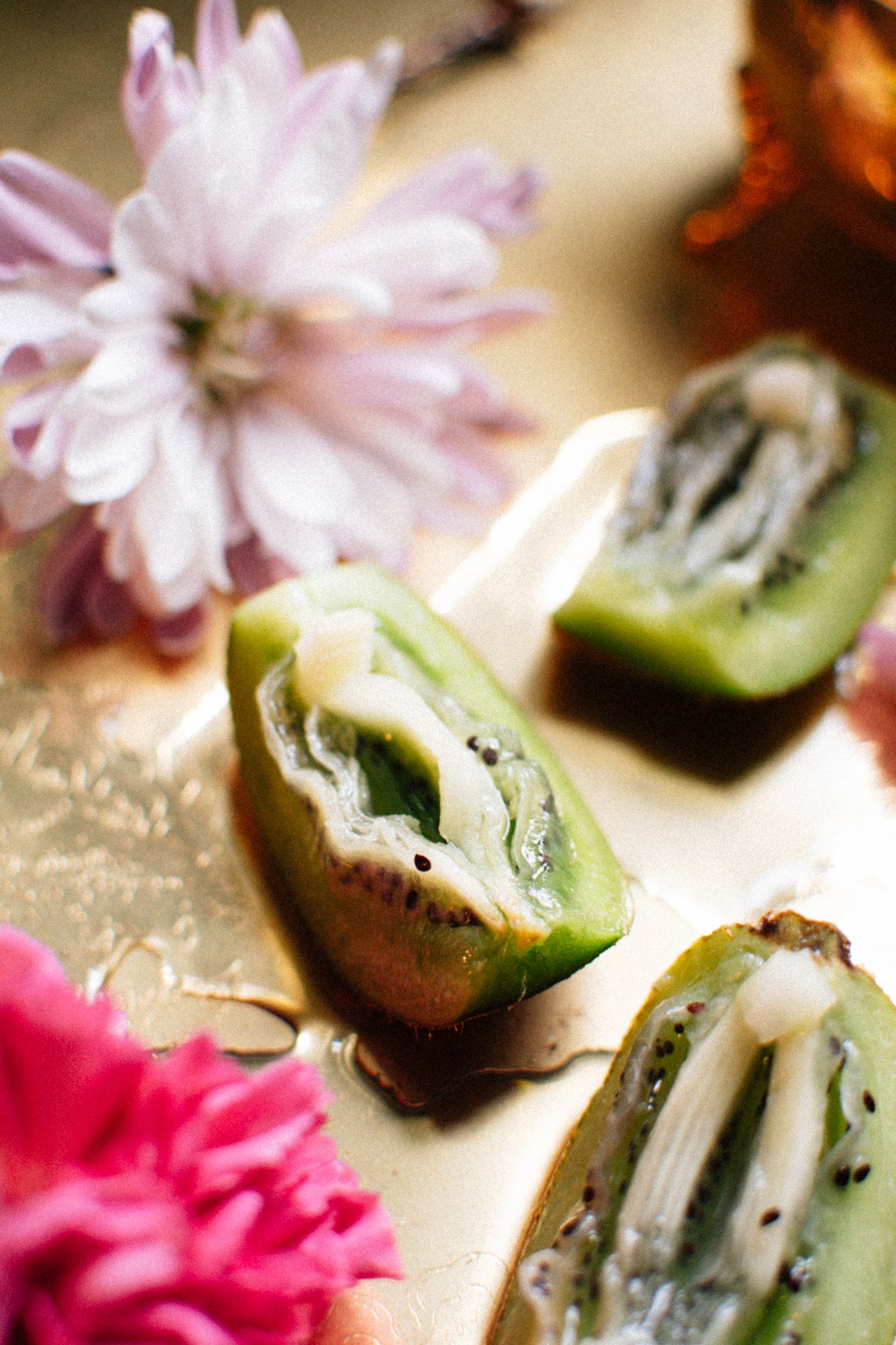
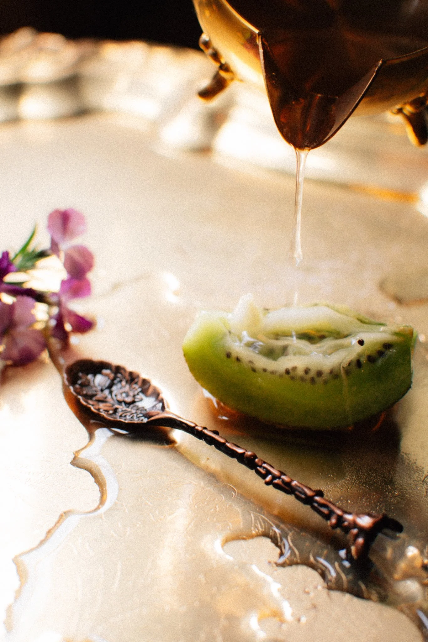
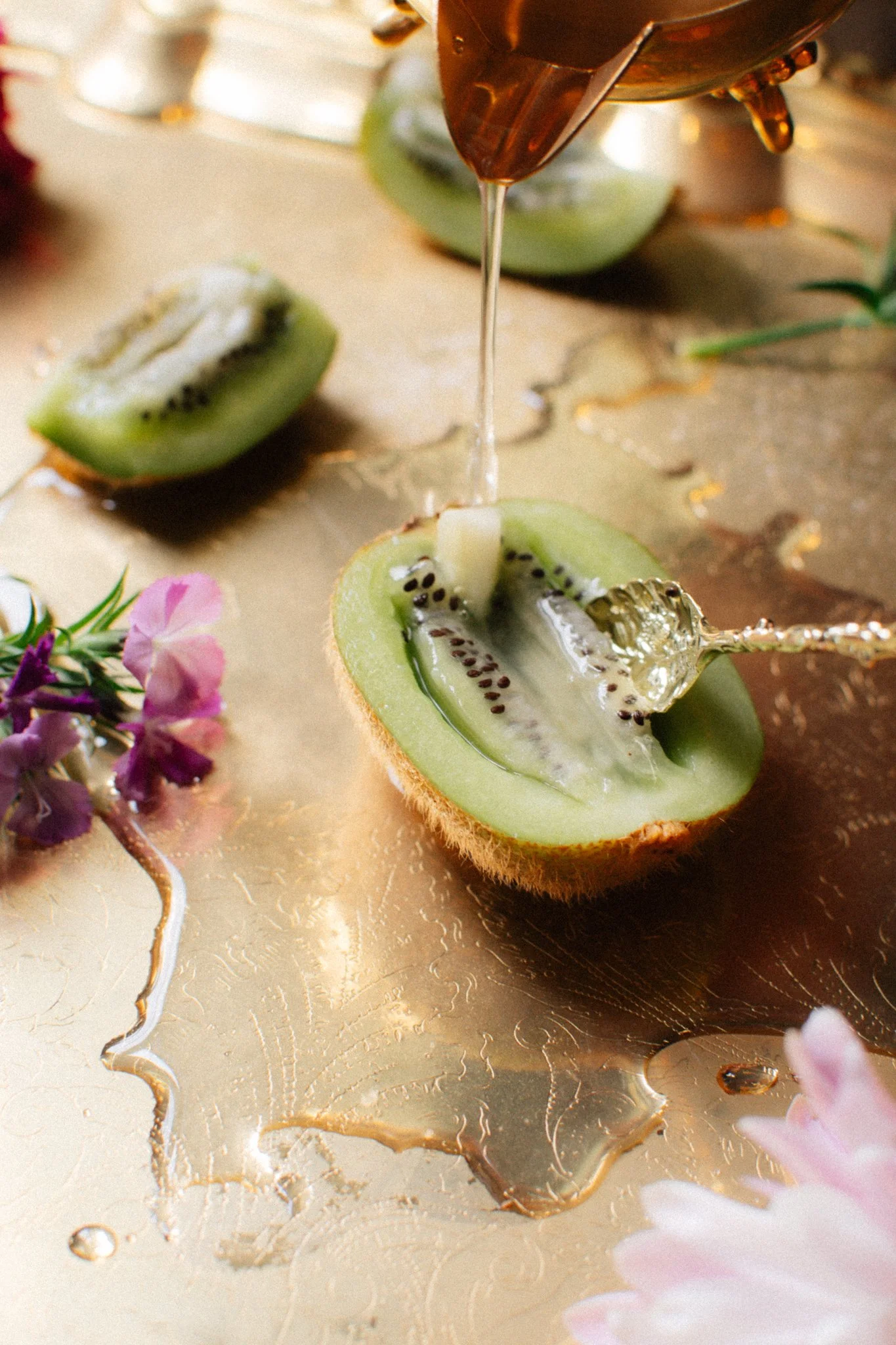
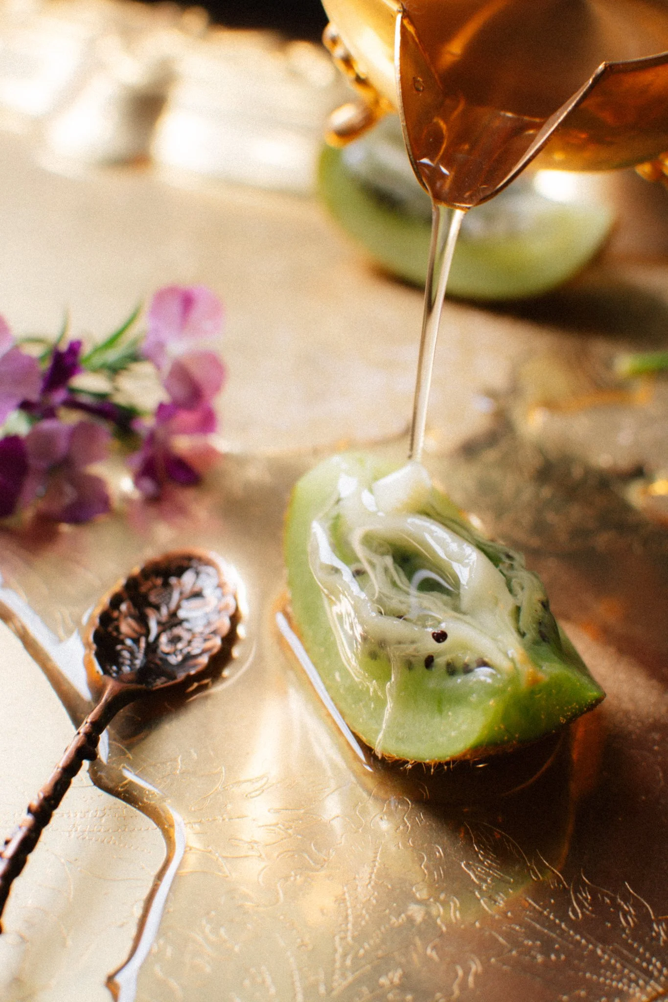
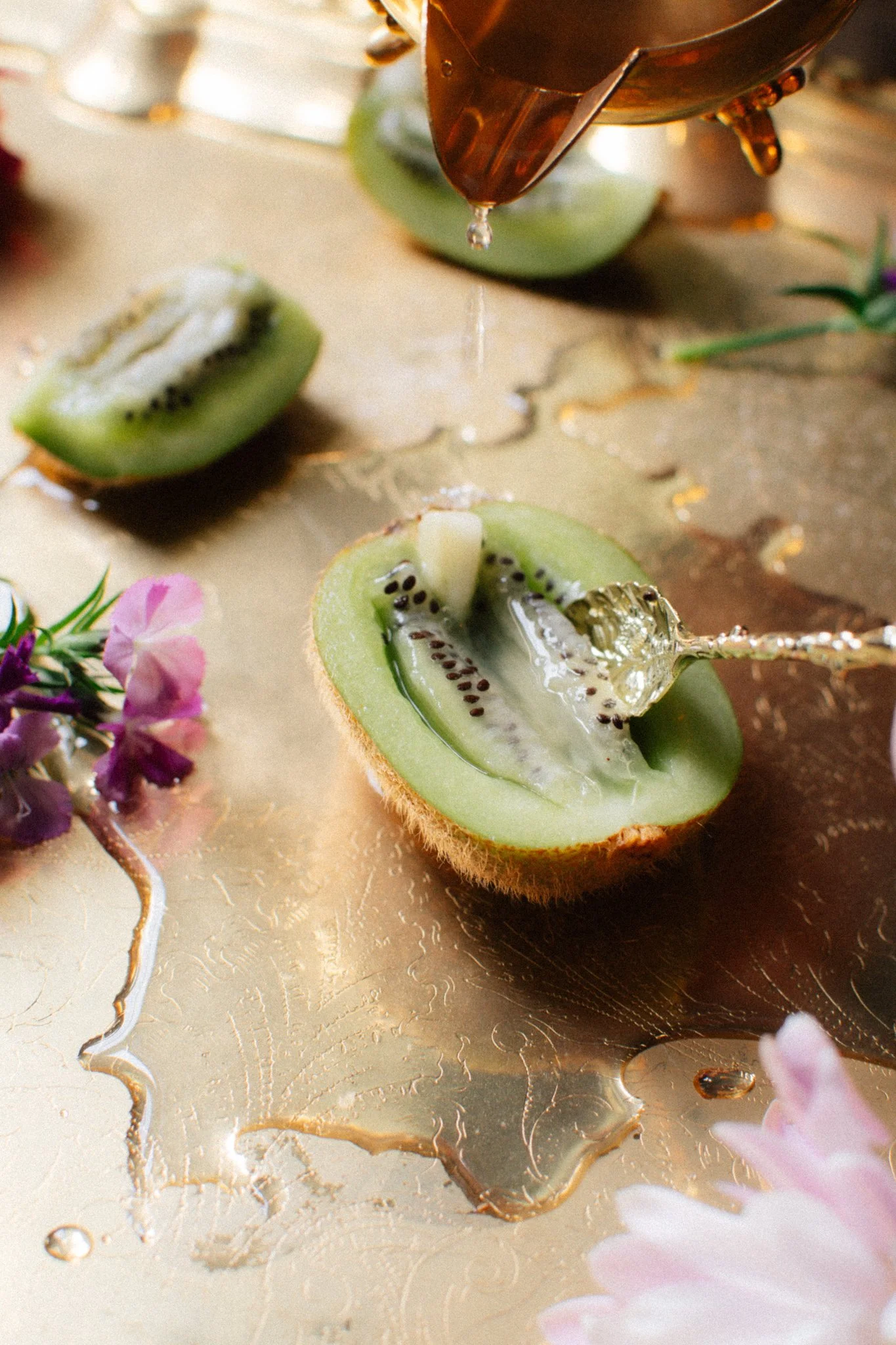
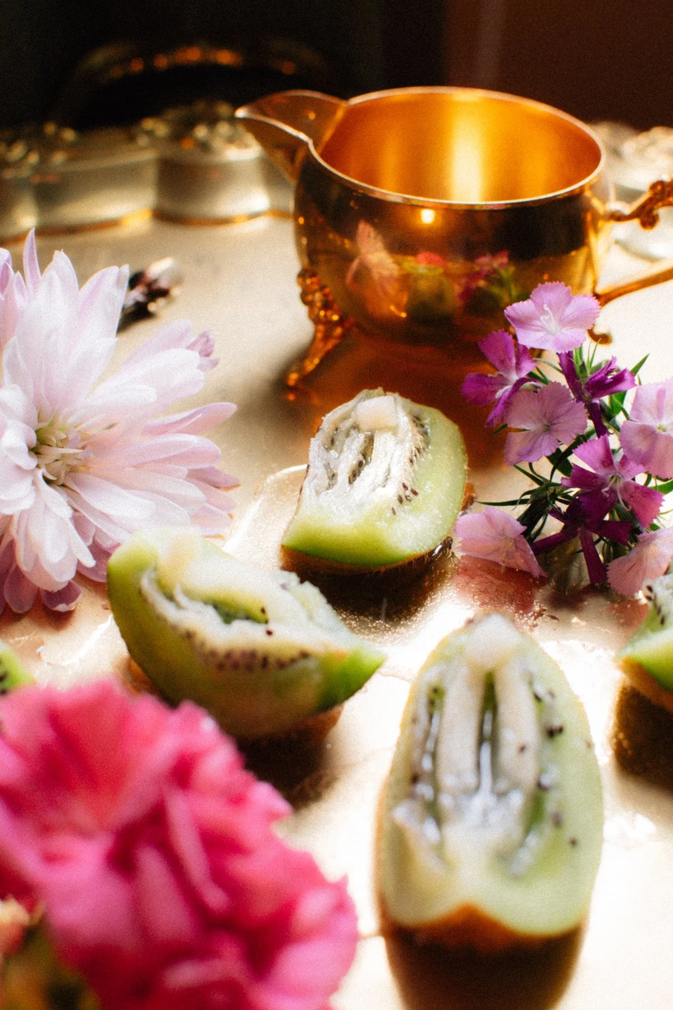
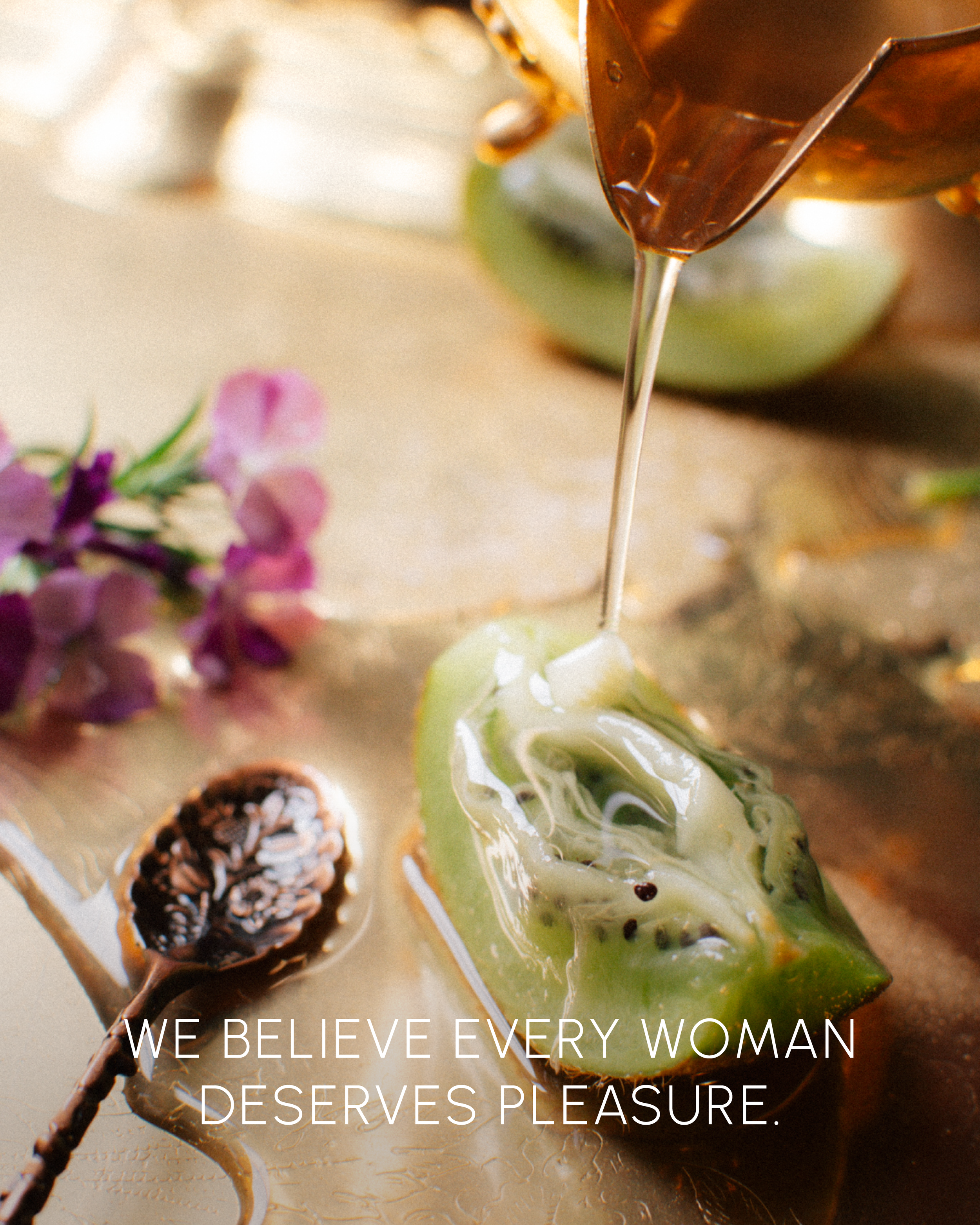
My wife and I were inspired when eating some kiwis and one idea led to an impromptu photoshoot in our home with the items we had around. We wanted to lean into a yonic, sensual energy in the photos without featuring actual people.
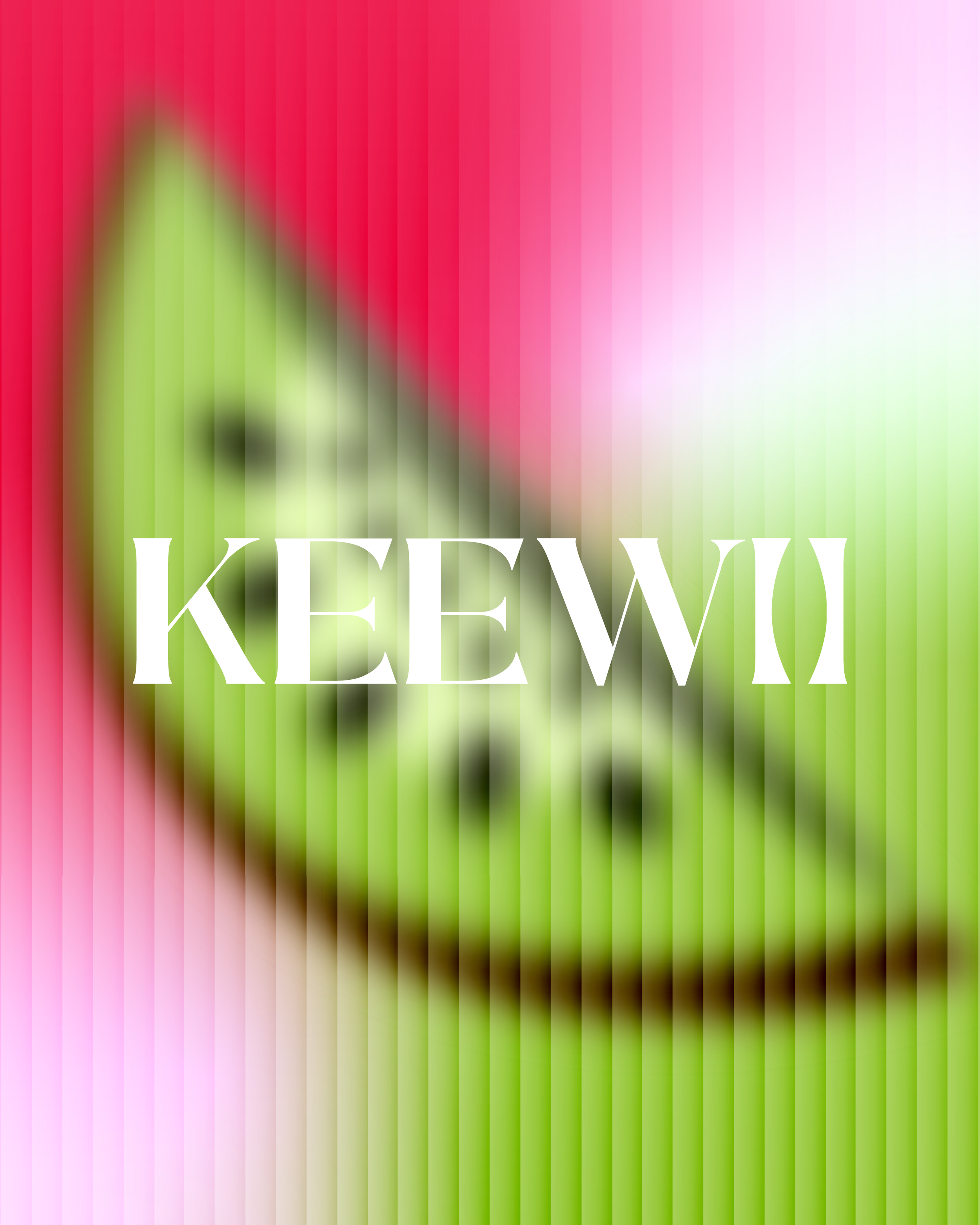
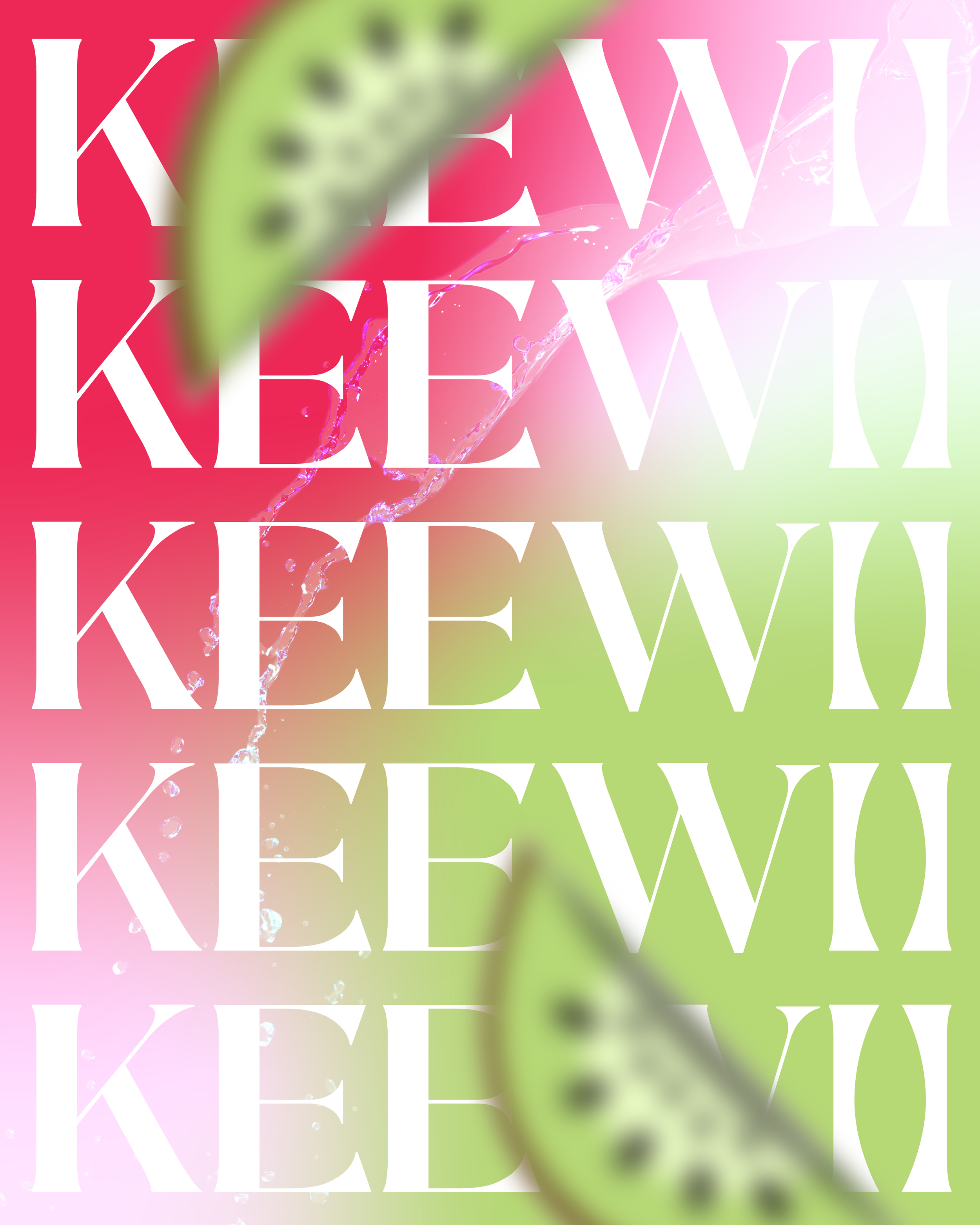
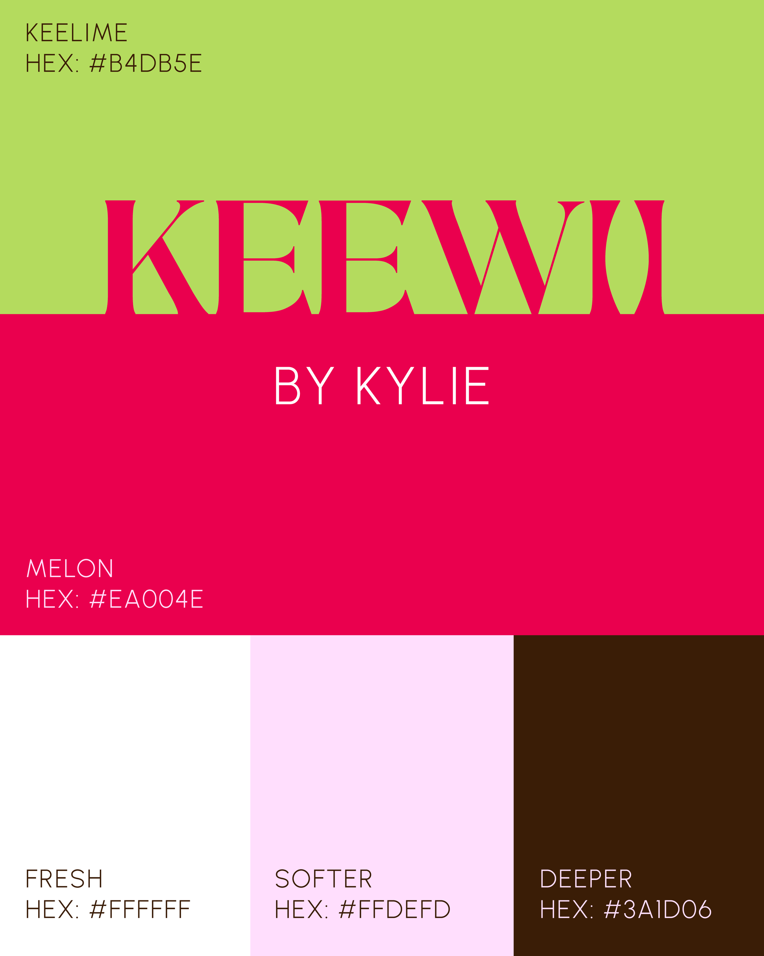
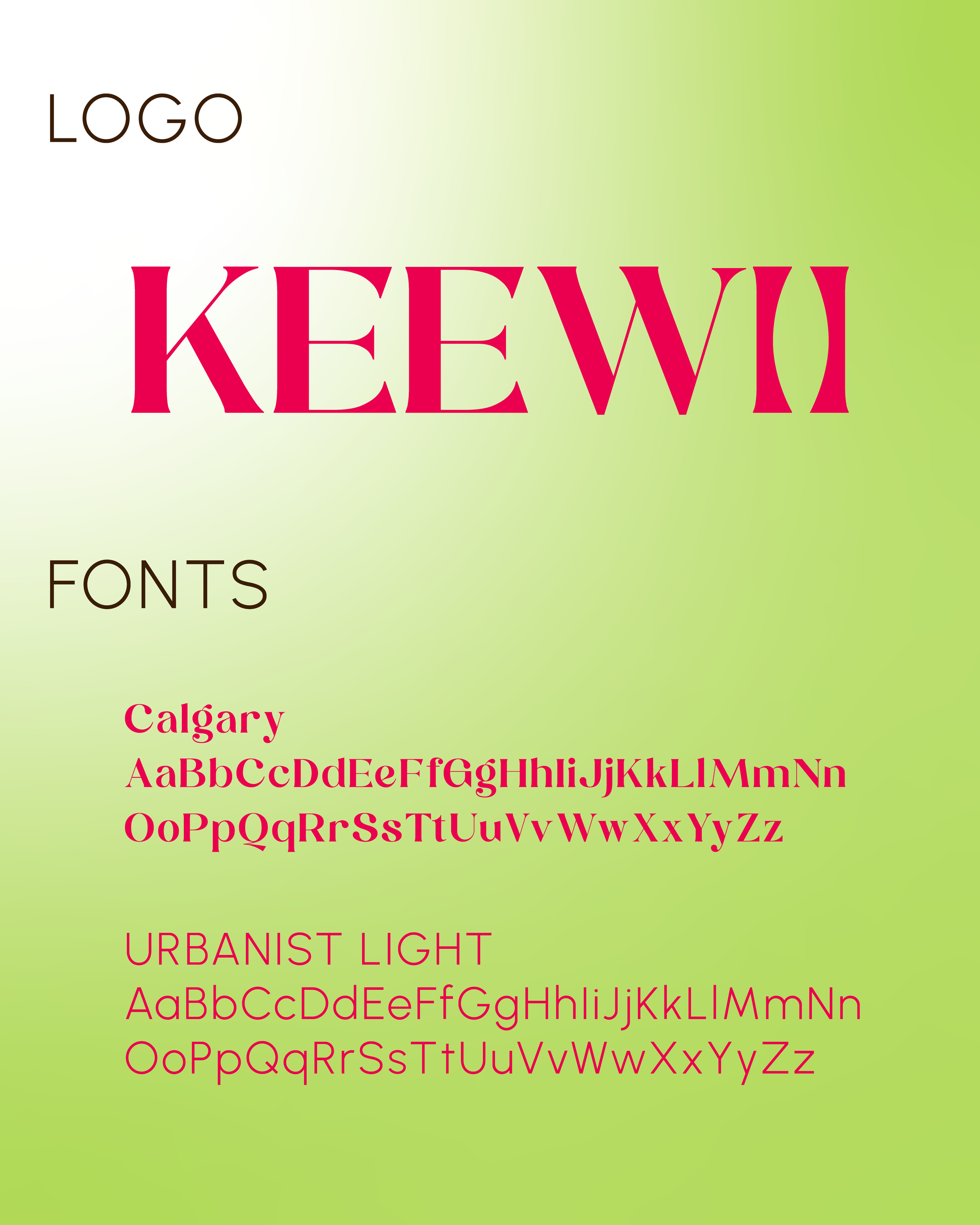
The primary color palette features an energetic blend of keylime green, hot melon pink, and a soft cool pink, each selected to evoke excitement, joy and a sense of freedom. Combined with a contemporary typeface and vintage-feel photography, these colors draw the eye and invite curiosity.
Scroll down to see the final brand come to life.
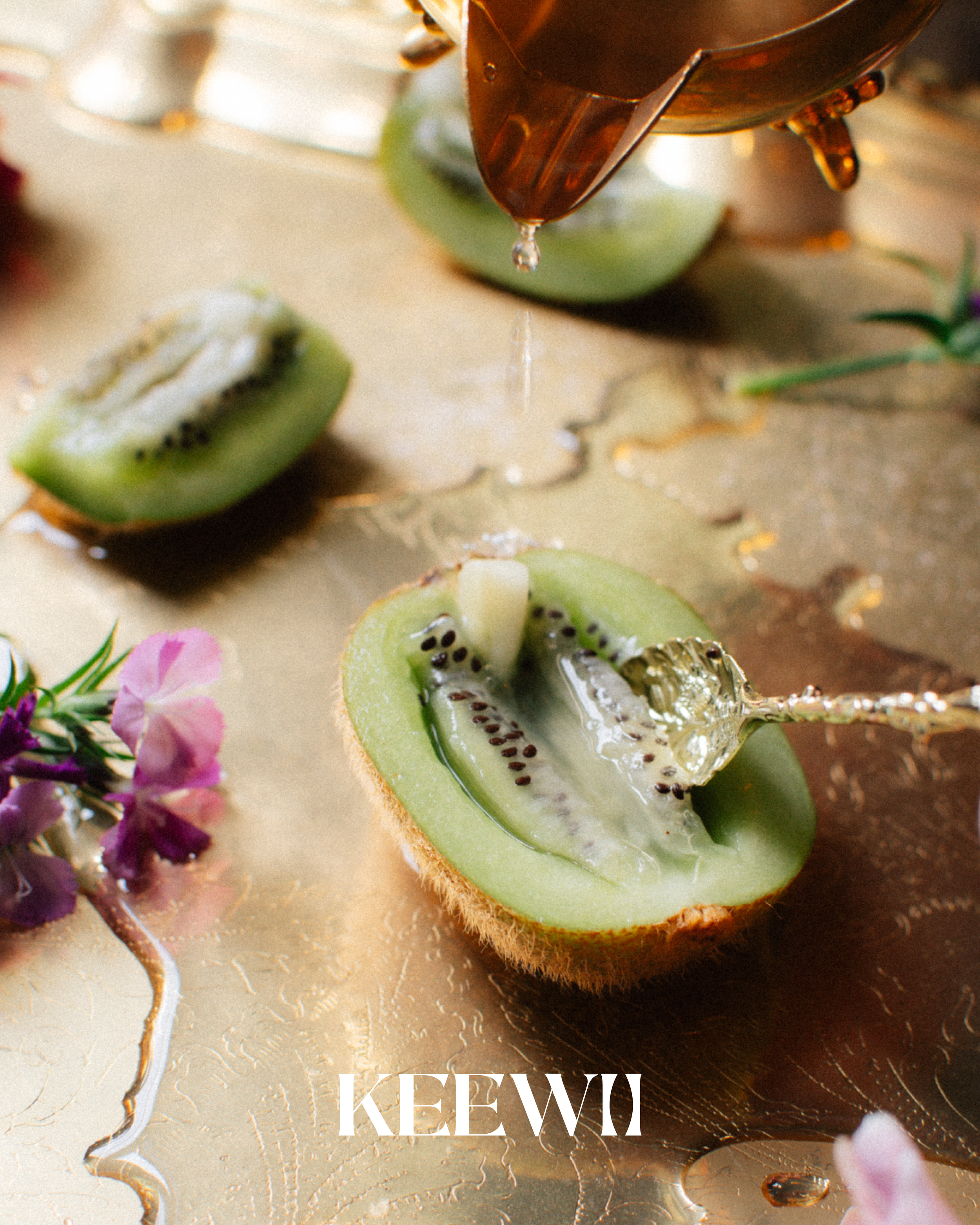
View the photos that inspired the brand below
〰️
View the photos that inspired the brand below 〰️